KLIK HIER!
Ik laat jou in 12 weken shinen met een sterk, energiek en veerkrachtig lijf. Meer weten?
Zoek niet verder!
WIL JIJ je energie boosten?
Stuur me een mailtje!
Wil jij een plekje in mijn blog? Vertel me jouw verhaal.
Partnerships
Schrijf iets
Zoek op de Blog
Gratis Supplementen Gids
Gratis Keto Starters Gids
Gratis Fitcheck
Gratis Energieboosters
Klaar om jouw energie een boost te geven? Hier deel ik alle slimme geheimen voor een sterk lijf en een fris koppie. Lees de blog!
Ik ben keto caatje
How to create a Compelling Sales-page with Showit
December 4, 2023
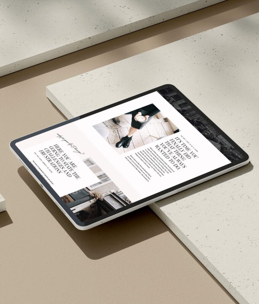
Let me take you on a journey – a story of late nights, early mornings, trial and error, and the triumph of finding an easier way. Hooray! When I first delved into adding sales pages to my website, it felt like navigating a maze blindfolded. I had two options – A) hours of wrestling with words and designs or B) the risky venture of hiring a designer only to end up tweaking everything myself. The struggle was real. That is until I discovered a game-changer: – Showit and TONIC sales pages.
- Crafting a Compelling Sales Page
- Step 1: Awareness
- Step 2: Consideration
- Step 3: Sale
- Ready to Embark on the Journey

Crafting a Compelling Sales Page: The Showit and TONIC Game-Changer
Imagine crafting a compelling sales page in just a few hours – one that not only looks fantastic but also converts like magic. Intrigued? Buckle up because I’m about to spill the secrets on creating sales pages for every new digital product.
Step 1: Awareness
Imagine your website as a stage. Your potential customer walks in, looking for something they need desperately. They need to know you’re the one who can provide it. This is where value-focused copy comes into play. And here’s the magic touch – TONIC sales pages come with built-in copy prompts. Yes, you heard it right. No more staring at a blank screen, wondering how to sell your amazing product. TONIC guides you through it effortlessly.

Step 2: Consideration
Now, we move to the consideration phase. Why should your potential customer trust you? Social proof is the secret weapon here. Testimonials from real people with real results act as beacons of trust. TONIC makes it a breeze to infuse social proof into your sales page. The templates already have social proof canvases, and all you need to do is replace the placeholders. Easy peasy.
How to craft a great testimonial?
Encourage your customers to provide detailed testimonials that highlight: The specific problem they faced. How your product provided a solution. The positive impact on their lives. Authenticity is key; real stories from real people build credibility.

Step 3: Sale
Time for the grand finale – the sale. A well-crafted user experience ensures that your customers can easily navigate your sales page and make a quick purchasing decision. This is where Showit and TONIC shine. With strategically placed call-to-action buttons, your customers can smoothly glide through the checkout process. No hurdles, just a seamless experience.
How to craft effective calls to action (CTAs):
Consider the following when creating your CTAs: Be clear and concise. Use action-oriented words. Highlight the benefit of taking action. For example: “Get Started Now” “Unlock Exclusive Access” “Claim Your Free Trial”
Ready to Embark on the Journey
The goal is to make it irresistibly easy for your customers to make that final click. Ready to embark on this journey? I’m here to cheer you on! Best of all, save 15% off on ANY TONIC template with my code, GOINGDIGITALWITHCA. And you’ll get your first MONTH for free at Showit if you click here. Talk about a good deal!
But there is more! Want to turn likes into loves and shares into sales? Your ultimate guide to 30 Scroll-Stopping CTAs awaits!
Click the link below to unlock the power of compelling calls-to-action. Elevate your engagement, followers, and sales game today! Enjoy!!
© 2025 Caroliene alexandra. all rights reserved.
Algemene voorwaarden
Privacy verklaring.
cookie beleid.
Met mijn no-nonsense aanpak help ik jou afvallen, meer energie krijgen en je lijf weer laten samenwerken met jouw dromen. Fijn dat je hier bent!
Ik ben Caroliene, beter bekend als Keto Caatje.
Welkom!
Designed by CAATJE ONTWERPT
Download de gratis Keto Kickstart Gids